

Related Posts

The Future of CRO is Cookieless: How to Prepare Your Personalization Strategy

Is Your A/B Testing Tool Lying to You? A Guide to Data Quality and Analytics Health Checks
How to Scale Your A/B Testing Program from 10 to 100 Tests Per Month

From Winning Test to C-Suite Report: How to Communicate the Business Impact of Experimentation

Beyond Button Colors: A Framework for High-Impact A/B Testing Ideas
What if 98% of your website visitors left without taking action—and you had no way to fix it? For most businesses, this isn’t a hypothetical. Studies show that fewer than 2 out of 100 visitors convert on ecommerce sites. The problem isn’t traffic or product quality. It’s the invisible wall between great ideas and their execution.
Customizing a website to improve conversions often feels like navigating a maze blindfolded. Teams brainstorm improvements—smoother checkout flows, clearer CTAs, personalized layouts—but technical hurdles stall progress. Without the right expertise, even simple changes take weeks. By then, opportunities vanish.

Traditional approaches crumble under these delays. Imagine running A/B tests that take months to implement or watching competitors act faster while your team debates priorities. This stagnation isn’t just frustrating—it’s expensive. Every unoptimized page leaks revenue.
I’ve seen companies pour money into ads to drive traffic, only to waste it on sites that don’t convert. The solution? Treating optimization as a continuous process, not a one-time fix. But that requires something most teams lack: dedicated technical support to turn insights into action.
Key Takeaways
- Less than 2% of website visitors convert, leaving massive room for improvement
- Technical delays cripple traditional conversion optimization strategies
- Slow implementation cycles lead to missed revenue opportunities
- Businesses often cycle between stagnation and rushed fixes
- Ongoing optimization requires specialized support structures
Establishing the Foundations of Conversion Rate Optimization
Most businesses pour money into attracting visitors but struggle to turn them into customers. The secret lies in building a system that transforms clicks into results—not through guesswork, but through structured analysis.

Understanding the Essential Concepts
Conversion optimization isn’t just about tweaking buttons or colors. It’s about combining hard numbers—like your current conversion rate—with real user behavior. Heatmaps show where people hover. Session recordings reveal frustration points. Feedback forms uncover hidden objections.
I’ve found that teams using both data types see faster improvements. Quantitative metrics tell you what’s happening, while qualitative insights explain why. Together, they create a roadmap for meaningful changes.
The Value of Continuous Optimization
Treating improvements as a one-off project leads to temporary gains. Visitors’ preferences shift monthly. Devices change. Competitors adapt. A single round of tweaks can’t keep up.
Continuous refinement lets you stay ahead. For example, adjusting checkout flows based on seasonal trends or updating CTAs to match new customer concerns. This approach turns optimization into a growth engine rather than a cost center.
By focusing on existing traffic, businesses reduce reliance on expensive ads. Why pay to attract more visitors if your site can’t convert them? Building this process creates compounding returns—better results with less spending over time.
Diagnosing the CRO Developer Bottleneck
How often do your optimization ideas get stuck waiting for technical execution? Teams frequently face roadblocks when trying to implement changes—even simple tweaks like adjusting forms or modifying checkout steps. The root cause often traces back to mismatched priorities and limited technical bandwidth.

Spotting Hidden Capacity Gaps
Common warning signs include A/B tests delayed for weeks and urgent fixes deprioritized. I’ve worked with companies where basic layout changes took 23 days because development teams handled five other projects simultaneously. These delays create a ripple effect—every stalled test means losing potential revenue from unconverted visitors.
Three critical questions help assess capacity:
- Do technical teams understand optimization goals?
- How many concurrent projects delay implementation?
- Are there skill gaps in handling modern testing tools?
| Constraint Type | Symptoms | Monthly Revenue Impact |
|---|---|---|
| Limited Staff | Backlogged task queues | $8,200+ lost |
| Skill Gaps | Basic coding errors | $3,500+ lost |
| Process Issues | Repeated scope changes | $12,000+ lost |
One ecommerce client discovered 40% of their “urgent” optimization requests were actually preventable. By streamlining approval workflows and training marketers on no-code tools, they reduced dependency on technical teams by 65%.
Quantifying these bottlenecks reveals their true cost. For every week of delay, businesses risk losing 2-7% of potential conversions. Addressing these constraints early turns stagnant processes into growth accelerators.
Allocating Dedicated Developer Resources for CRO Success
The difference between stagnant websites and high-converting ones often comes down to resource allocation. Companies like Dermalogica saw sales jump 119% within a month after assigning specialized teams to handle data-driven improvements. This isn’t magic—it’s strategic prioritization.
Leveraging Data to Prioritize Technical Tasks
I start by mapping potential changes against two factors: implementation effort and conversion impact. A simple table reveals where to focus:
| Task | Development Hours | Projected Lift |
|---|---|---|
| Checkout flow redesign | 40 | 22% |
| Mobile load optimization | 15 | 18% |
| Form field reduction | 8 | 9% |
W. Titley & Co. used this method to boost revenue 190%. Their team focused on high-impact fixes first—like simplifying address entry fields—before tackling complex projects.
Integrating Technical Expertise into Optimization
Three models work best for sustained results:
- Embedded specialists: Full-time team members focused solely on conversion improvements
- Agile pods: Cross-functional groups tackling specific optimization sprints
- Automation partnerships: Combining internal knowledge with external tools for rapid testing
Molekule’s 75% conversion leap came from creating a dedicated pod that implemented changes within 48 hours of identifying opportunities. This approach turns insights into action before trends shift.
Building a Data-Driven CRO Analysis Framework
Turning clicks into customers requires more than guesswork—it demands precise data analysis. I’ve watched teams waste months chasing random ideas instead of following evidence. A structured framework transforms scattered observations into clear paths for improvement.
Establishing Clear, Actionable Metrics
Start by defining what success looks like. Track metrics like funnel completion rates, time-to-conversion, and micro-conversions (newsletter signups, cart additions). Avoid vanity numbers—focus on indicators tied directly to revenue.
One client increased sales by 31% simply by measuring scroll depth on product pages. They discovered 68% of visitors never saw key benefits listed below the fold. This quantitative insight guided their redesign priorities.
Utilizing Heatmaps, Session Recordings, and Feedback
Combine three data types to uncover hidden issues:
- Heatmaps: Reveal where users click, hover, or ignore
- Session replays: Show how visitors navigate step-by-step
- Surveys: Capture why users abandon processes
I recently analyzed a checkout page where 43% of mobile users exited at the payment step. Session recordings showed confusing error messages, while surveys cited security concerns. Fixing both issues boosted mobile conversions by 19% in two weeks.
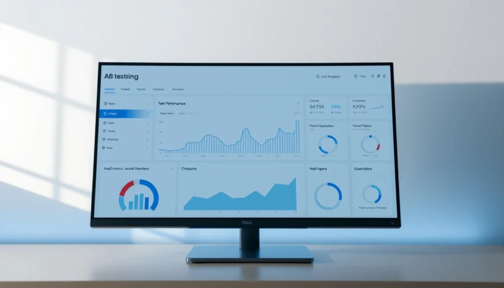
Implementing Effective A/B Testing Strategies
What separates random website tweaks from changes that actually boost sales? Systematic A/B testing transforms hunches into measurable improvements. I’ve seen brands increase conversions by 14% simply by testing headline variations—but only when they follow proven methods.
Designing Variations Based on User Data
Start with why you’re testing. A checkout flow test should address specific pain points—like abandoned carts—not just guesswork. Analyze heatmaps showing where users hesitate, or session recordings revealing form-field confusion.
Create hypotheses like: “Changing the CTA from ‘Buy Now’ to ‘Get 24-Hour Access’ will increase clicks by 18% because it emphasizes urgency.” Tools like Optimizely or VWO help build variations quickly without coding.
Interpreting Test Results for Continuous Improvement
Never declare victory too soon. I once stopped a button-color test after three days, thinking red outperformed green. Rerunning it for two full weeks revealed the opposite—traffic patterns skewed initial results.
Follow this decision framework:
- Wait for 95% statistical confidence
- Check if all device types show consistent trends
- Verify results against secondary metrics (like bounce rate)
One SaaS company improved trial signups by 29% by treating tests as iterative cycles. Each “conclusive” result became the baseline for the next experiment, creating compounding gains.
Optimizing User Experience Across Devices
Smartphones now drive two-thirds of online purchases, yet many sites still treat mobile visitors as an afterthought. I’ve watched companies lose 37% of potential sales by using desktop-first designs that frustrate thumb-scrolling users. True cross-device optimization requires more than shrinking content—it demands reimagining interactions for smaller screens.
Responsive Design vs. Mobile-First Strategy
Responsive layouts adapt existing elements. Mobile-first design builds specifically for handheld use. The difference matters. Sites loading in 1.3 seconds on desktops often take 5+ seconds on phones—a delay causing 53% of users to abandon carts.
Three mobile-specific fixes deliver quick wins:
- Compress images without quality loss
- Replace dropdown menus with thumb-friendly tiles
- Position CTAs where thumbs naturally rest
One fashion retailer saw mobile conversions jump 41% after enlarging buttons from 32px to 48px. Their previous “optimized” design required precision tapping—a common oversight in responsive-only approaches.
Technical Considerations for Seamless Interactions
Device-specific optimization requires balancing speed and functionality. Use this table to prioritize improvements:
| Element | Desktop Approach | Mobile Solution |
|---|---|---|
| Navigation | Multi-level menus | Hamburger menu with quick links |
| Forms | 10+ fields | Progressive disclosure (3 fields max) |
| Media | Auto-play videos | Static images with tap-to-play |
Test every change across actual devices—emulators miss real-world quirks like shaky subway connections. I recommend running weekly load-time audits using tools like Lighthouse. Sites scoring above 90 see 68% lower bounce rates on mobile.
Streamlining Checkout and Payment Processes
Cart abandonment haunts online businesses—70% of shoppers vanish before completing purchases. I’ve watched clients recover millions by redesigning their final steps. The key lies in balancing security with simplicity.
Start by cutting non-essential fields. One travel site reduced form length from 12 fields to 5, boosting conversion rates by 31%. Keep only what’s needed: name, shipping address, payment details. Optional fields like “Company Name” belong post-purchase.
Express checkout options slash completion time. Services like Apple Pay and PayPal let returning buyers finish in three taps. This table shows their impact:
| Payment Method | Adoption Rate | Average Speed |
|---|---|---|
| Guest Checkout | 64% | 2.1 minutes |
| Digital Wallets | 83% | 38 seconds |
| Saved Cards | 71% | 55 seconds |
Forcing account creation backfires. 26% of first-time buyers abandon when required to register. Offer guest checkout with optional post-purchase signup. Test phrasing like “Create account for faster future purchases” instead of mandatory fields.
Payment diversity matters. 13% of shoppers leave when their preferred method isn’t available. Analyze your user base—younger audiences favor Buy Now Pay Later services, while older demographics trust credit cards. Update options quarterly based on usage data.
Every website’s sweet spot differs. Run A/B tests comparing three vs. five payment icons. Monitor mobile vs. desktop preferences. Continuous optimization turns checkout pages from revenue leaks into conversion engines.
Utilizing User Feedback and Behavioral Analysis
Unlocking why visitors leave requires more than numbers—it demands listening to their voices. I’ve found that combining direct feedback with behavioral patterns reveals obstacles numbers alone miss. This dual approach turns vague frustrations into actionable fixes.
Collecting and Analyzing Visitor Data
Start by asking users what stopped them from converting. Tools like SurveyMonkey or Typeform capture specific pain points: “I didn’t trust the security badges” or “The sizing chart wasn’t clear.” Pair these insights with behavioral tools:
- Hotjar recordings show where users rage-click or scroll past key content
- Google Analytics flags pages with 80%+ bounce rates
- Heatmaps expose ignored CTAs or distracting elements
One client discovered 62% of mobile users abandoned their checkout after encountering a poorly formatted address field. Surveys revealed concerns about typos causing delivery issues. Fixing both the design and adding real-time validation boosted conversions by 27%.
Prioritize recurring themes in feedback. If multiple users mention unclear return policies, test adding a FAQ section near product descriptions. Behavioral data then validates if engagement increases. This loop turns subjective opinions into measurable improvements.
Three steps to merge qualitative and quantitative insights:
- Tag feedback by category (trust, usability, information gaps)
- Match tags to corresponding behavior metrics
- Test solutions addressing both layers
Teams using this method resolve issues 3x faster. Instead of guessing why a page underperforms, you’re solving confirmed problems users vocalize. Continuous analysis turns feedback into a roadmap for sustainable growth.
Applying Fast, Responsive Design and Custom Code
Your website’s loading speed silently shapes visitor decisions—delay one second, and conversions drop 7%. I’ve watched brands lose customers to faster competitors while debating design tweaks. Modern users expect instant responsiveness paired with intuitive interfaces. Balancing these demands requires technical precision.
Balancing Aesthetic Appeal With Functional Performance
Responsive design isn’t just screen adaptation—it’s about predicting user needs. Mobile visitors scroll faster and click less. I prioritize features like:
- Dynamic image compression (cutting load times by 1.8 seconds)
- Conditional content delivery based on device capabilities
- Progressive enhancement for older browsers
Custom code solves unique challenges. One client reduced checkout errors 63% by replacing standard forms with gesture-based inputs. But avoid over-engineering—every script impacts speed. Test custom solutions against baseline performance using tools like Lighthouse.
Page speed directly affects revenue. Sites loading under 2 seconds see 15% higher conversion rates than slower counterparts. Use this table to audit critical elements:
| Element | Ideal Load Time | Common Fixes |
|---|---|---|
| Hero images | <0.5s | WebP format + lazy loading |
| Third-party scripts | <1s | Async loading + culling unused tools |
Continuous refinement keeps technical debt low. Treat design and code as living systems—not finished products. Teams embracing this mindset maintain 38% faster sites than industry averages.
FAQ
How do I prioritize technical tasks when resources are limited?
I start by analyzing performance metrics like page load speed, bounce rates, and conversion paths. Tools like Google Analytics or Hotjar help identify high-impact areas. For example, if checkout abandonment is high, I’ll prioritize optimizing form fields or payment gateways first.
What’s the most effective way to integrate developers into conversion rate strategies?
I involve developers early in the process by sharing user behavior data and heatmaps. Collaborative tools like Figma or Jira ensure alignment on A/B test designs. Regular syncs help address technical constraints while maintaining focus on UX improvements.
How can I validate if design changes actually improve conversions?
I rely on structured A/B testing frameworks. For instance, testing button colors against control versions using Optimizely or VWO provides clear data. Statistical significance thresholds (typically 95%+) ensure results aren’t random. Post-test, I analyze secondary metrics like time-on-page to avoid unintended consequences.
Why does mobile responsiveness directly impact conversion rates?
Over 60% of web traffic comes from mobile devices. I audit sites using Chrome DevTools to ensure elements like CTAs or forms adapt seamlessly. Slow mobile load times can increase abandonment by 53%, so I compress images and leverage lazy loading to maintain speed.
What role does behavioral analysis play in optimizing checkout flows?
Session recordings reveal where users hesitate or drop off. If visitors abandon carts after seeing shipping costs, I’ll test free shipping thresholds. Tools like Crazy Egg or FullStory help pinpoint friction points, which I address through iterative design tweaks.
How do I balance custom code needs with site performance?
I use Lighthouse scores to benchmark performance. For custom scripts, I prioritize asynchronous loading and minimize DOM size. If a dynamic pricing widget slows page speed, I’ll work with developers to lazy-load it or use cached data to maintain sub-3-second load times.
Can heatmaps replace traditional user feedback in CRO?
While heatmaps show where users click or scroll, they don’t explain “why.” I combine them with surveys (via Qualtrics or Typeform) for context. For example, if heatmaps show ignored navigation menus, direct feedback might reveal unclear labeling as the root cause.