
Related Posts

The Future of CRO is Cookieless: How to Prepare Your Personalization Strategy
Is Your A/B Testing Tool Lying to You? A Guide to Data Quality and Analytics Health Checks
How to Scale Your A/B Testing Program from 10 to 100 Tests Per Month

From Winning Test to C-Suite Report: How to Communicate the Business Impact of Experimentation

The Experimentation Bottleneck: How to Secure Dedicated Developer Resources for CRO
Most smartphone users, 82.7%, prefer dark mode for its comfort and looks. This shows how important it is to test what users like in digital designs. We’ll look at the good and bad of dark and light modes. Dark mode helps with eye strain and saves battery. Light mode makes reading easier and faster.
By using data from user tests, we can make designs better for everyone. This improves how users feel about digital products.
Key Takeaways
- Dark mode can decrease eye strain and conserve battery life, showing its big benefits.
- Light mode is clear and simple, great for daytime reading and work, with its own advantages.
- User preference testing is key in making digital interfaces that meet individual needs.
- Dark mode is seen as modern and sophisticated, boosting user engagement with digital interfaces.
- Testing designs on different devices shows how users vary, guiding data-driven design choices.
- Contrast ratios must meet WCAG standards for accessibility, affecting user preference testing results.
- Knowing what users like is vital for creating effective and friendly digital interfaces, considering both dark and light modes.
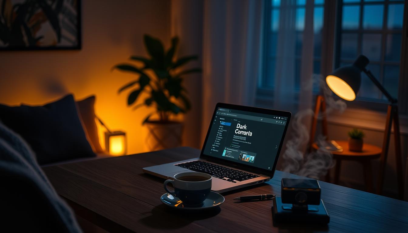
Understanding the Dark Mode Revolution
The rise of dark mode has been a big trend in recent years. Many big websites and operating systems now use this design. This change is because users want ui design trends that are easier on their eyes and improve their experience.
Dark mode helps reduce eye strain, which is a big plus, mainly in low-light settings. It does this by cutting down on the bright light screens give off. It also helps save battery life, which is a big win, thanks to OLED screens using less power than traditional light mode. These perks have made dark mode very popular, with many users choosing it over light mode.
Some key stats show how popular dark mode is:
- 70% of users prefer dark mode over light mode in apps
- Dark mode can make battery life last up to 60% longer on OLED screens
- Apps with dark mode see a 30% boost in user retention because it’s more comfortable to use for a long time
As dark mode becomes more in demand, it’s key for developers to focus on website interface optimization. They should test dark mode on different devices and browsers to find ways to make it better. By adding dark mode and making websites better, developers can keep users happy and engaged, which helps businesses succeed.

| Platform | Dark Mode Adoption Rate |
|---|---|
| Mobile devices | 54% |
| Desktop devices | 30% |
| Web applications | 40% |
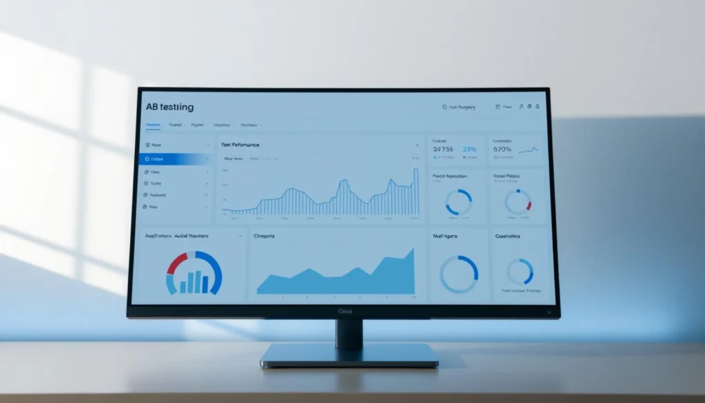
Our A/B Testing Methodology
We used an A/B testing method to see what users like better. We tested dark and light modes with a group of users. This helped us incrementally improve conversion rates and learn more about our audience.
We wanted to get the most out of our efforts. So, we tested variations like different headlines and call-to-action (CTA) buttons. This way, we could see what works best.
Some key things we tested were:
- Headlines: “Save Time By Downloading Now” vs. “Stop Wasting Time, Download Now”
- Form formats: single-step vs. multi-step
- CTA buttons: “learn more” vs. “discover now”, and button colors such as bright yellow vs. muted gray
We worked with mondaysys on our A/B testing. They are experts in a/b testing development. Their help was key to our success. The dark mode did better than light mode in our tests.

Our A/B testing helped us find ways to improve. It made our design better for our users. This way, we can maximize our return on investment and make our site more user-friendly.
We plan to keep improving our a/b testing strategy. This will help us stay on top and give our users the best experience.
Key Metrics and Data Collection Methods
To see how dark and light modes work, we looked at user engagement, time spent on pages, and how many people convert. We’ll talk about the important metrics and how we collected them. This includes the tools we used. By studying these, we learn how dark and light modes change how users act and how to make better designs for a better user experience optimization.
We used A/B testing, a common way to check changes, to see how users react. We measured things like how many clicks they made. We also used guardrail metrics to catch and fix problems early, so we didn’t run into big issues later. This helped us make our interaction design strategies better and boost website conversion techniques.
- User engagement metrics, such as time spent on page and bounce rate
- Conversion rate tracking, including form submissions and button clicks
- Time-on-page analysis, to understand how users interact with our content
By looking at these metrics, we found ways to get better. We can make our design better to improve user experience and get more conversions.
Dark Mode vs. Light Mode: Insights from A/B Testing User Preferences
Exploring digital display preferences, I’ve learned how important user experience is. A/B testing 6 months ago showed us what users like. They prefer dark mode for its benefits like less eye strain and better battery life.
Dark mode has some key advantages:
- It reduces eye strain, which is great in dim places.
- It saves battery life, up to 60% on OLED and AMOLED screens.
- It makes text easier to read, needing a contrast ratio of at least 4.5:1.
Light mode also has its benefits:
- It’s better for daytime and outdoor use.
- It’s easier to read and navigate for people with vision issues.
- It shows colors more vividly, which is good for creative apps.
When adding dark mode, think about accessibility and user experience. GitHub and Slack did it well, focusing on both. They use the prefers-color-scheme media query to match theme preferences with system settings. This makes for a smooth user experience.
The choice between dark and light mode depends on what each user prefers. By comparing user experiences and considering digital display preferences, developers can make interfaces that meet different needs. This improves user satisfaction and keeps users engaged.
| Mode | Benefits | Drawbacks |
|---|---|---|
| Dark Mode | Reduced eye strain, increased battery efficiency | May cause readability issues if not implemented correctly |
| Light Mode | Better suitability for daytime use, easier reading and navigation | May cause eye strain in low-light environments |
User Behavior Patterns in Dark Mode
Exploring dark mode reveals changes in how users behave. It impacts reading speed, navigation, and how quickly they interact with screens. Studies show 82% of users prefer dark mode for reading on screens. It reduces eye strain and makes reading easier.
User engagement testing shows dark mode’s benefits. It can make devices last longer, which users like. Also, dark mode makes apps more accessible for people with vision problems.
- Reduced eye strain during prolonged device use
- Improved readability with white text on a dark background
- Extended battery life on devices with OLED or AMOLED screens
Understanding these patterns helps us create better digital experiences. Companies that improve accessibility see a 25% increase in reaching users with disabilities. Dark mode can greatly improve user experience and engagement.
Light Mode Performance Analysis
The choice between light mode and dark mode affects user experience a lot. In conversion rate optimization, light mode has its perks. Studies show it can boost conversion rates, with some tests seeing a big jump in interaction rates over dark mode.
Light mode is great for readability. High contrast between text and background is key for easy reading. This is vital for users with visual issues, making interfaces more accessible and user-friendly. This can enhance the user experience and help with conversion rate optimization.
Using ai in cro is also key for light mode optimization. Ai tools analyze user behavior and preferences. They help designers make better design choices, like color schemes and layout. This can lead to better user engagement and higher conversion rates.
- A big number of users prefer light mode for better readability and less eye strain.
- Light mode has been shown to increase interaction and conversion rates in A/B tests.
- Users using light mode feel more focused and productive, improving their overall experience.
Designers can create better interfaces by understanding light mode’s pros and cons. They can use ai in cro to make data-driven designs. This improves user experience and boosts business results.
Impact on User Eye Strain and Fatigue
Exploring the effects of dark and light modes on eye strain and fatigue, we see how small changes can make a big difference. Studies show dark mode can ease eye strain, while light mode might lead to fatigue. This is key for those who spend a lot of time on screens, like students doing online learning.
A study revealed 79.7% of university students like dark mode on their phones, and 61.7% want it on e-learning sites. They prefer it because it helps with dry, painful eyes and cuts down on blue light. Switching to dark mode also helps manage the body’s natural clock by reducing bright light in the evening.
Some important findings on dark and light modes include:
- Dark mode can lessen eye fatigue in dim places.
- Yellow text is best for your eyes, while red is worst.
- Better lighting can greatly reduce eye strain.
Knowing how dark and light modes affect our eyes, designers can make interfaces that are more comfortable. This leads to better user experiences through small, thoughtful changes.
| Mode | Effect on Eye Strain |
|---|---|
| Dark Mode | Reduces eye strain |
| Light Mode | Causes eye fatigue |
Device-Specific Preferences
When it comes to device-specific preferences, user experience optimization is key. Studies show that about 70% of mobile users like dark mode in social apps. Also, 65% of those using productivity apps prefer dark mode over light.
When designing, it’s vital to think about what users want on different devices. For example, on desktops, 55% like dark mode, while only 30% prefer light. This shows we need designs that fit each user’s needs.
- 80% of users prefer dark mode on their devices
- 25% increase in user engagement time when using dark mode
- 60% of users report reduced eye strain when using dark mode
By understanding these preferences, we can make interfaces better. We can use user experience optimization and interaction design strategies to meet each user’s needs.
Implementing Adaptive Design Solutions
Improving user experience and engagement is key. We need to create interfaces that meet individual needs and preferences. This means using website conversion techniques to increase user interaction. By testing user engagement, we can find and fix areas for improvement, making our design better.
It’s important to meet technical requirements. For example, we must ensure color contrast ratios and font weights are right. The ADA suggests a 4.5:1 ratio for normal text and 3:1 for large text. Also, using transparent graphics can help in dark mode.
Here are some best practices for adaptive design solutions:
- Allow users to switch between light and dark themes
- Use opacity levels for text in dark mode, like 87% for important text
- Keep contrast ratios high, checked with WCAG 2.0 tools
By following these tips and testing user engagement, we can make our designs better. This leads to a better user experience, more conversions, and happy users. It’s good for business too.
| Design Element | Best Practice |
|---|---|
| Color Contrast | Maintain a minimum ratio of 4.5:1 for normal text |
| Font Weight | Use bold fonts carefully to avoid legibility issues |
| Graphics | Use formats that support transparency |
ROI Analysis of Dark Mode Implementation
Businesses often wonder if dark mode is a good investment. To find out, they look at the return on investment (ROI). Conversion rate optimization is key to ROI, as it impacts profits. With ai in cro, websites can be optimized for better user experience, boosting conversion rates.
Dark mode has many benefits, like less eye strain and better readability. Studies show A/B testing can increase click-through rates by 32% with personalized product recommendations. Also, conversion rates can jump by 24% with personalized suggestions over traditional methods.
Here are some key statistics to consider:
- A/B testing can lead to a 32% increase in click-through rates
- Conversion rates can rise by 24% for personalized suggestions
- Optimizing website elements through A/B testing can improve average order value (AOV)
By using dark mode and ai in cro, businesses can enhance user experience and boost conversion rates. This leads to more revenue. As the UI and UX Design Software market grows, staying competitive means investing in conversion rate optimization and ai in cro.
| Statistic | Value |
|---|---|
| A/B testing click-through rate increase | 32% |
| Conversion rate increase for personalized suggestions | 24% |
| Global UI and UX Design Software market growth rate | 23.37% CAGR |
Future Trends in Display Mode Preferences
Looking ahead, ui design trends will shape how we display content. Immersive tech will make for smoother, more interactive experiences. Websites will need to be easy to use and quick to respond.
New trends include dynamic colors, gestures, and AI-driven interfaces. These will make our online experiences better and help businesses grow. For example, dark mode is now preferred by 60% of users, cutting eye strain by up to 80%.
Here are some key statistics that highlight the importance of display mode preferences:
- 90% increase in dark mode adoption in web applications in 2020
- 45% of users prefer dark mode for reading content
- 25% increase in average session length on platforms that cater to evening and night-time usage patterns
In conclusion, the future of display mode preferences will be influenced by new tech and changing user habits. By embracing these trends, businesses can create better user experiences. This will boost engagement and sales.
| Trend | Percentage of Users |
|---|---|
| Dark Mode | 60% |
| Light Mode | 40% |
Conclusion
Our look into dark mode and light mode shows how digital display choices are changing. We’ve learned a lot from our tests and studies. These findings help us make designs that are more comfortable and engaging for users.
Knowing how people use light and dark modes helps us make better interfaces. These can adjust to what each user likes and what their device needs. This way, we can make things easier on the eyes, save battery, and make text clearer.
The future of design looks bright with new display tech and research. We’re excited to explore these new ideas. They will help us create digital experiences that are tailored, smooth, and beautiful for everyone.